7.11 kmeans visualise single variable
20220104
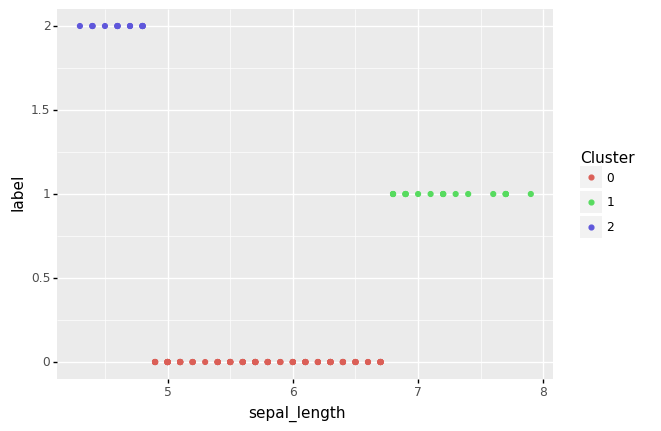
A visualisation of the clusters where the input data consists of just a single variable will essentially be a 1-dimensional plot. For our plot we add the cluster label as the value for the y-axis, and so sharply distinguishing the clusters.
Using a pipeline we can use mlr to extract a single column from the original training dataset. The training dataset is saved using tee so that it can be used later if need be. The data is then piped through train , predict, and visualise.
cat iris.csv |
    mlr --csv cut -f sepal_length |
    tee iris_1.csv |
    ml train kmeans 3 |
    ml predict kmeans iris_1.csv |
    ml visualise kmeans -o kmeans_iris_pr_vis_1.png
The resulting plot, indicating the three clusters found, can be displayed:
Your donation will support ongoing availability and give you access to the PDF version of this book. Desktop Survival Guides include Data Science, GNU/Linux, and MLHub. Books available on Amazon include Data Mining with Rattle and Essentials of Data Science. Popular open source software includes rattle, wajig, and mlhub. Hosted by Togaware, a pioneer of free and open source software since 1984. Copyright © 1995-2022 Graham.Williams@togaware.com Creative Commons Attribution-ShareAlike 4.0